Section 3: Trust and Satisfaction in specific services

[toc]

Australian Competition and Consumer Commission

Who is accessing
Image
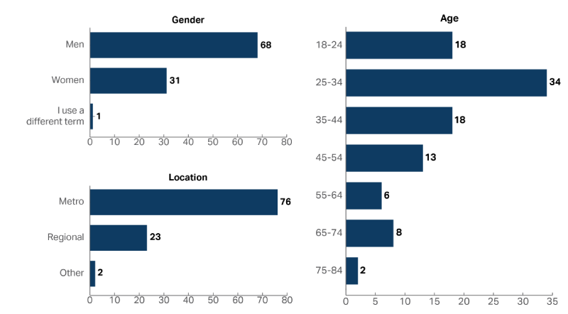
A graph showing the demographic composition of the people who accessed the Australian Competition and Consumer Commission in 2022-23, including Age, Gender and Location. Approximately twice as many as men (68%) accessed the ACCC as women (31%), and 25-34 year olds were the most common age group with 34% of people who accessed the service.

How are people accessing

Image
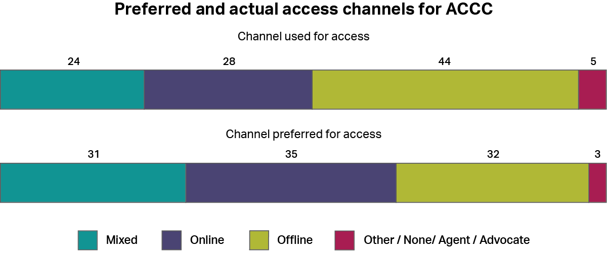
A graph showing how people accessed the Australian Competition and Consumer Commission, whether by online channels, offline channels, a mixture of both, or other channels. It also shows how people would have preferred to access the service using the same categories. The most common type of access was “offline” with 44%, and the most common preferred channel was “online” with 35%.

Historical Performance

Image
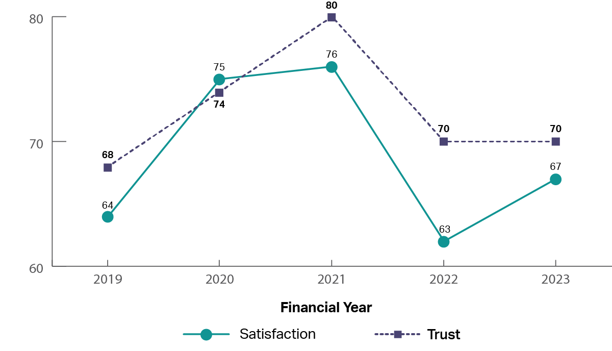
A graph showing the historical trust and satisfaction of the Australian Competition and Consumer Commission from 2019 to 2023. It shows both trust and satisfaction increasing from 2019 (trust 68%, satisfaction 64%) through to 2021 (trust 80%, satisfaction76%), and reducing between 2021 and 2023 (trust 70%, satisfaction 67%).

The experience

Image
image of five stars

The top rated drivers of satisfaction were: 

  1. ‘Information from the service was accurate’
  2. ‘Staff did what they said they would do’
Image
image of five stars, only one star is coloured showing a low review

The lowest rated drivers of satisfaction were: 

  1. ‘The amount of time it took to reach an outcome was acceptable’
  2. ‘I was kept informed of progress and wait times’

Australian Electoral Commission

Who is accessing
Image
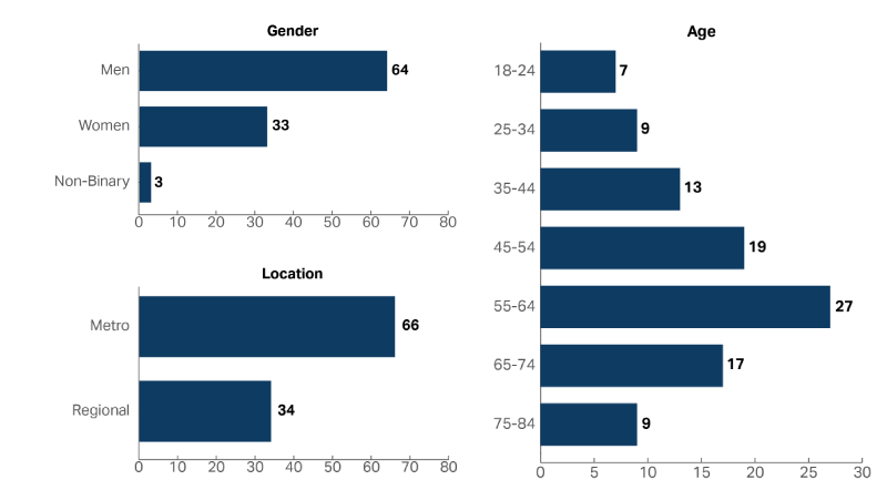
A graph showing the demographic composition of the people who accessed the Australian Electoral Commission in 2022-23, including Age, Gender and Location. Almost twice as many as men (64%) accessed the AEC as women (33%), and 55-64 year olds were the most common age group with 27% of people.

How are people accessing

Image
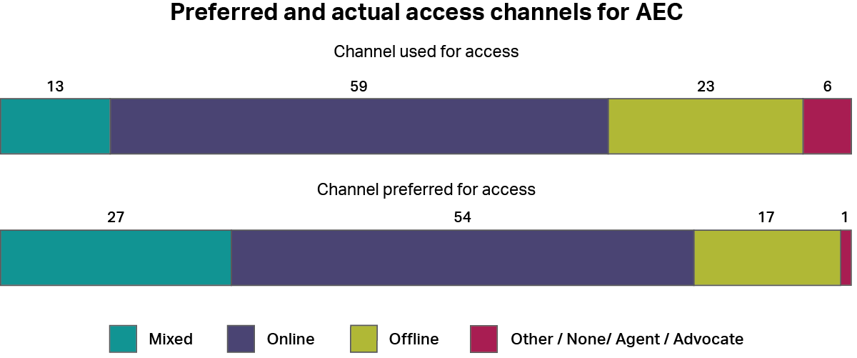
A graph showing how people accessed the Australian Electoral Commission, whether by online channels, offline channels, a mixture of both, or other channels. It also shows how people would have preferred to access the service using the same categories. The most common type of access was “online” with 59%, and the most common preferred channel was also “online” with 54%.

Historical Performance

Image
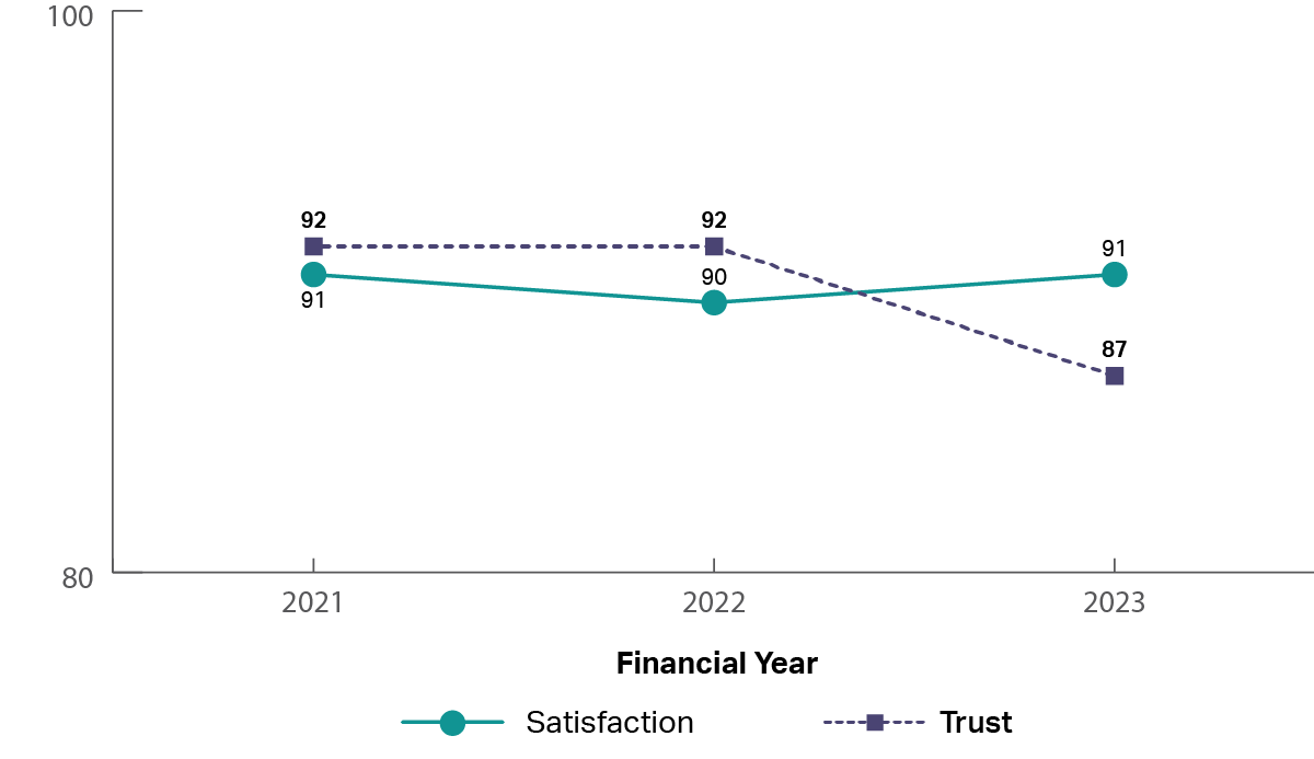
A graph showing the historical trust and satisfaction of the Australian Electoral Commission from 2021 to 2023. It shows both trust and satisfaction being relatively stable throughout (2021: trust 92%, satisfaction 91%; 2023: trust 87%, satisfaction 91%)

The experience

Image
image of five stars

The top rated drivers of satisfaction were: 

  1. ‘I got what I needed’
  2. ‘It was easy to access the service(s)’
Image
image of five stars, only one star is coloured showing a low review

The lowest rated drivers of satisfaction were: 

  1. ‘It was explained how my personal information would be used and stored’
  2. ‘It was clear I could give feedback about my experience’

Australian Taxation Office

Who is accessing
Image
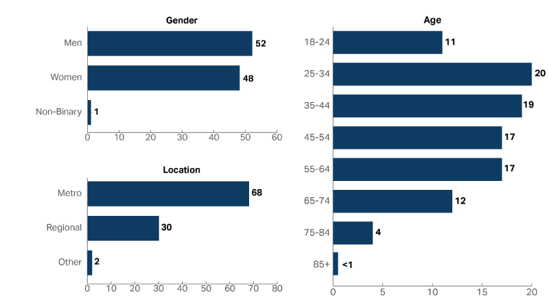
A graph showing the demographic composition of the people who accessed the Australian Taxation Office in 2022-23, including Age, Gender and Location. Men and women accessed at approximately the same rates (Men 52%, Women 48%) and 25-34 year olds were the most common age group with 20% of people who accessed the service in this age group.

How are people accessing

Image
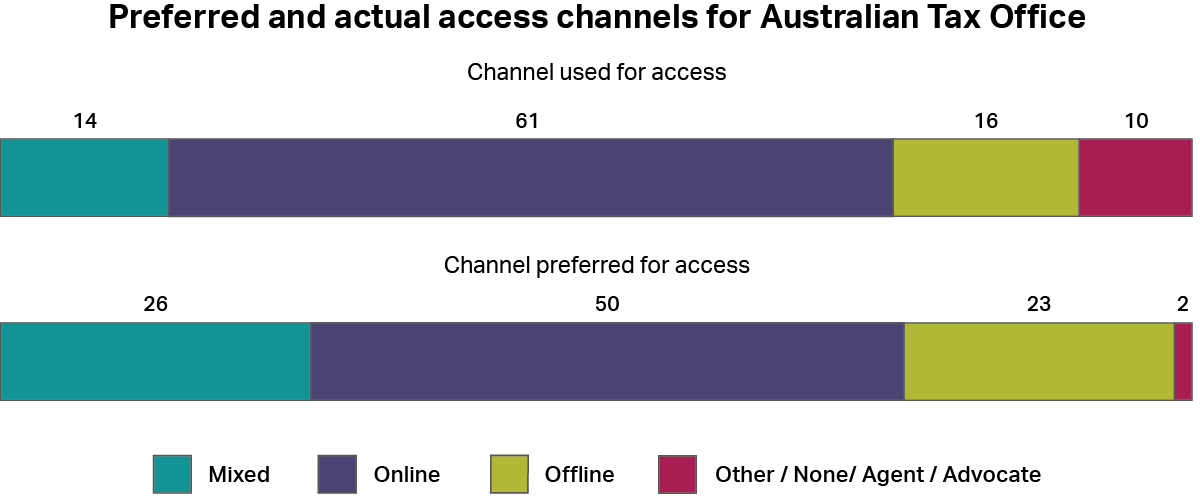
A graph showing how people accessed the Australian Taxation Office, whether by online channels, offline channels, a mixture of both, or other channels. It also shows how people would have preferred to access the service using the same categories. The most common type of access was “online” with 61%, and the most common preferred channel was also “online” with 50%.

Historical Performance

Image
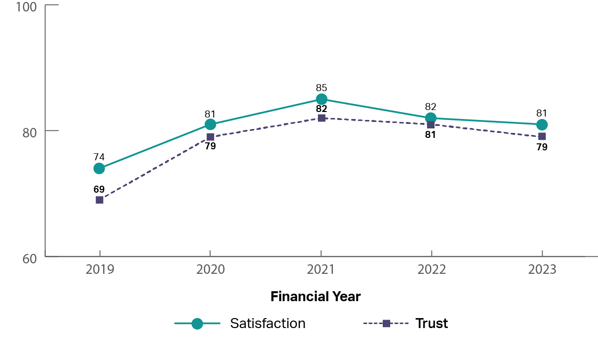
A graph showing the historical trust and satisfaction of Australian Taxation Office from 2019 to 2023. It shows both trust and satisfaction increasing from 2019 to 2021 and then being relatively stable (2019: trust 69%, satisfaction 74%; 2021: trust 82%, satisfaction 85%; 2023: trust 79%, satisfaction 81%)

The experience

Image
image of five stars

The top rated drivers of satisfaction were: 

  1. ‘Information from the service was accurate’
  2. ‘Staff treated me with respect’
Image
image of five stars, only one star is coloured showing a low review

The lowest rated drivers of satisfaction were: 

  1. ‘I was kept informed of progress and wait times’
  2. ‘It was clear I could give feedback about my experience’

Department of Agriculture, Fisheries and Forestry

Who is accessing
Image
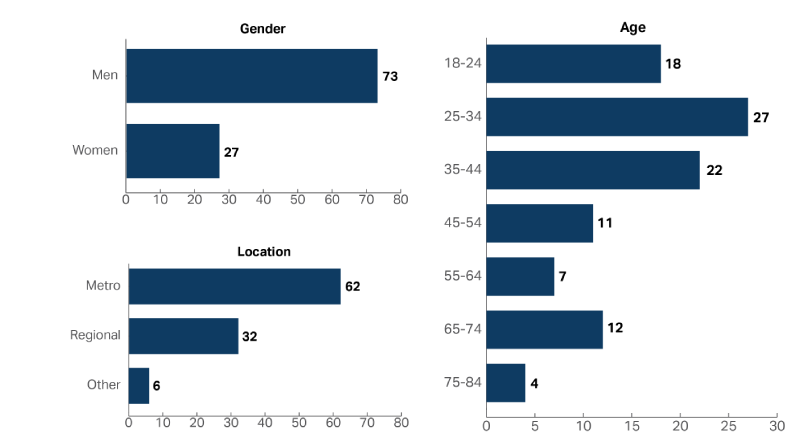
A graph showing the demographic composition of the people who accessed the Department of Agriculture, Fisheries and Forestry in 2022-23, including Age, Gender and Location. Almost three times as many men accessed the service as women (Men 73%, Women 27%) and 25-34 year olds were the most common age group with 27% of people.

How are people accessing

Image
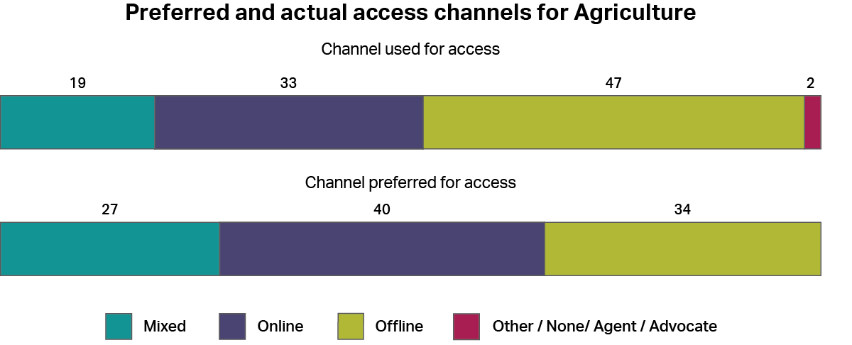
A graph showing how people accessed the Department of Agriculture, Fisheries and Forestry, whether by online channels, offline channels, a mixture of both, or other channels. It also shows how people would have preferred to access the service using the same categories. The most common type of access was “offline” with 47%, and the most common preferred channel was “online” with 40%.

Historical Performance

Image
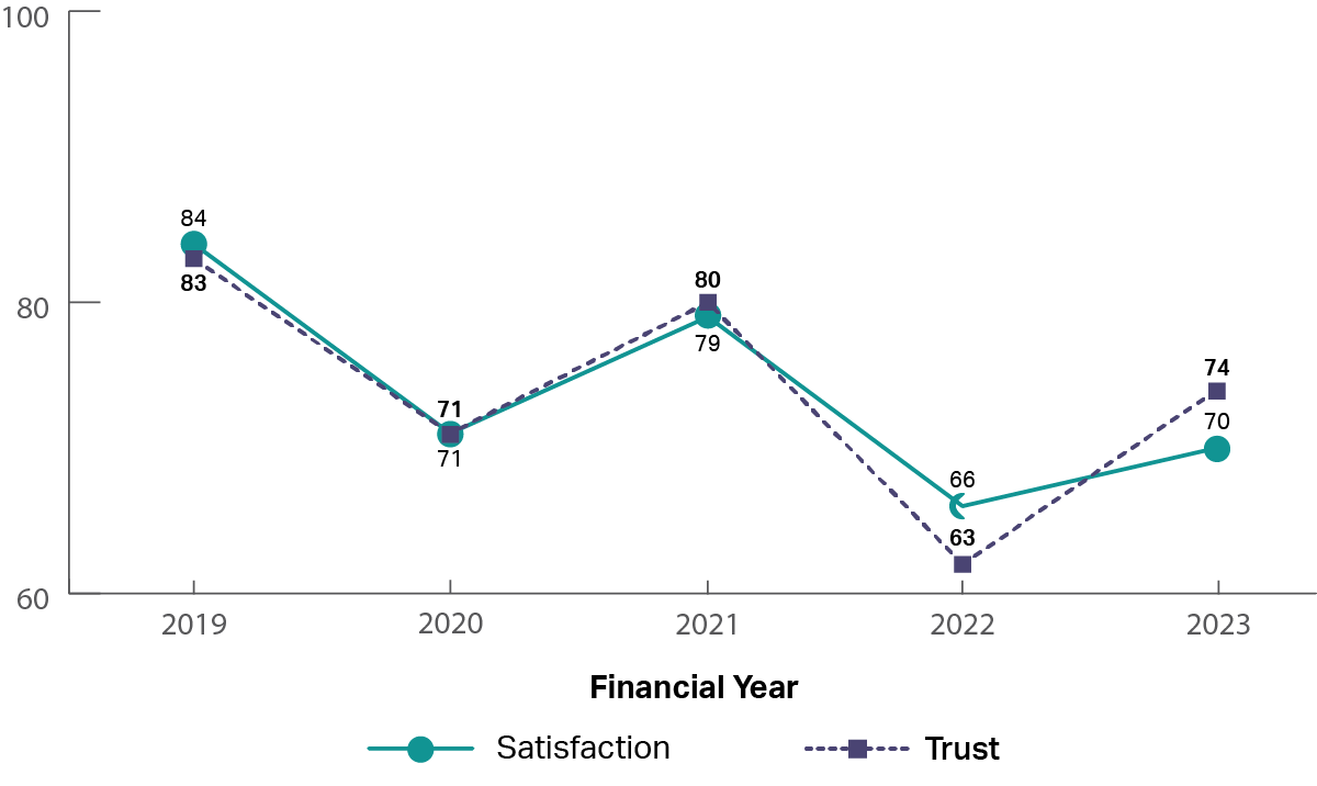
A graph showing the historical trust and satisfaction of Department of Agriculture, Fisheries and Forestry from 2019 to 2023. It shows both trust and satisfaction have decreased from 2019 to 2023 and then being relatively stable (2019: trust 83%, satisfaction 84%; 2023: trust 74%, satisfaction 70%)

The experience

Image
image of five stars

The top rated drivers of satisfaction were: 

  1. ‘Information from the service was easy to understand’
  2. ‘Information from the service was accurate’
Image
image of five stars, only one star is coloured showing a low review

The lowest rated drivers of satisfaction were: 

  1. ‘The amount of effort I had to put in was reasonable’
  2. ‘I was kept informed of progress and wait times’

Department of Education

Who is accessing
Image
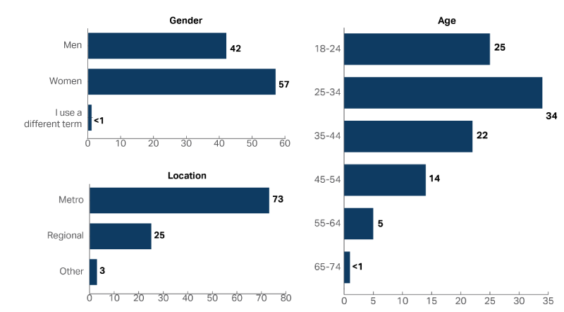
A graph showing the demographic composition of the people who accessed the Department of Education in 2022-23, including Age, Gender and Location. Women accessed the service more than men (Women 57%, Men 42%) and 25-34 year olds were the most common age group with 34% of people.

How are people accessing

Image
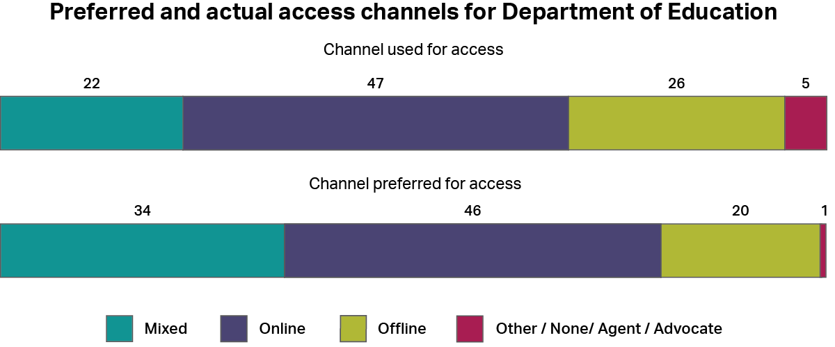
A graph showing how people accessed the Department of Education, whether by online channels, offline channels, a mixture of both, or other channels. It also shows how people would have preferred to access the service using the same categories. The most common type of access was “online” with 47%, and the most common preferred channel was also “online” with 46%.

Historical Performance

Image
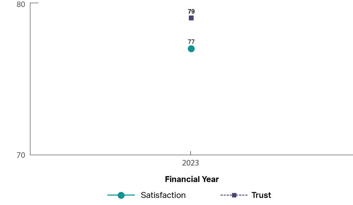
A graph showing the historical trust and satisfaction of Department of Education. The department of Education is a new department and only 2023 is shown.  It shows that trust is 79% and satisfaction is 77% in 2023.

The experience

Image
image of five stars

The top rated drivers of satisfaction were: 

  1. ‘I got what I needed’
  2. ‘Staff treated me with respect’
Image
image of five stars, only one star is coloured showing a low review

The lowest rated drivers of satisfaction were: 

  1. ‘I was kept informed of progress and wait times’
  2. ‘It was clear I could give feedback about my experience’

Department of Employment and Workplace Relations

Who is accessing
Image
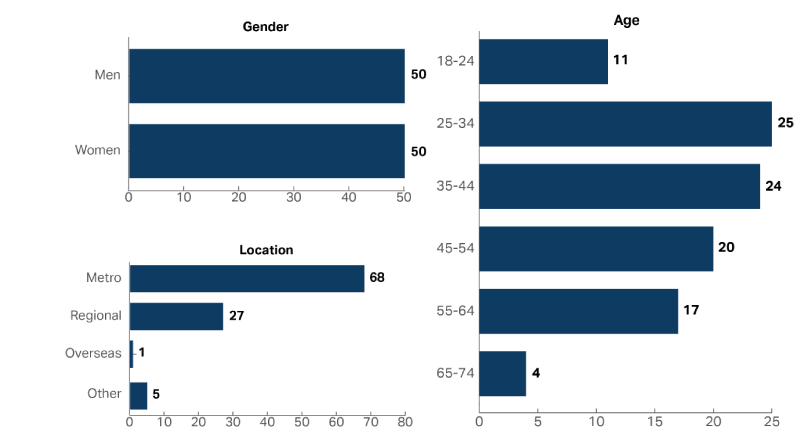
A graph showing the demographic composition of the people who accessed the Department of Employment and Workplace Relations in 2022-23, including Age, Gender and Location. Women and men accessed the service equally (Women 50%, Men 50%) and 25-34 year olds were the most common age group with 25% of people.

How are people accessing

Image
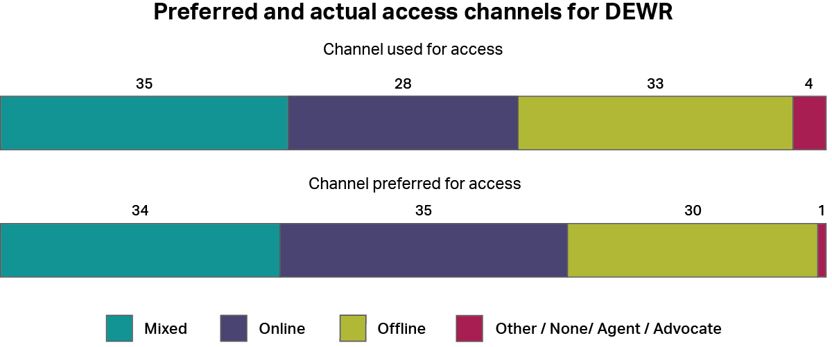
A graph showing how people accessed the Department of Employment and Workplace Relations, whether by online channels, offline channels, a mixture of both, or other channels. It also shows how people would have preferred to access the service using the same categories. The most common type of access was “mixed” with 35%, and the most common preferred channel was “online” with 35%, followed by “mixed” with 34%.

Historical Performance

Image
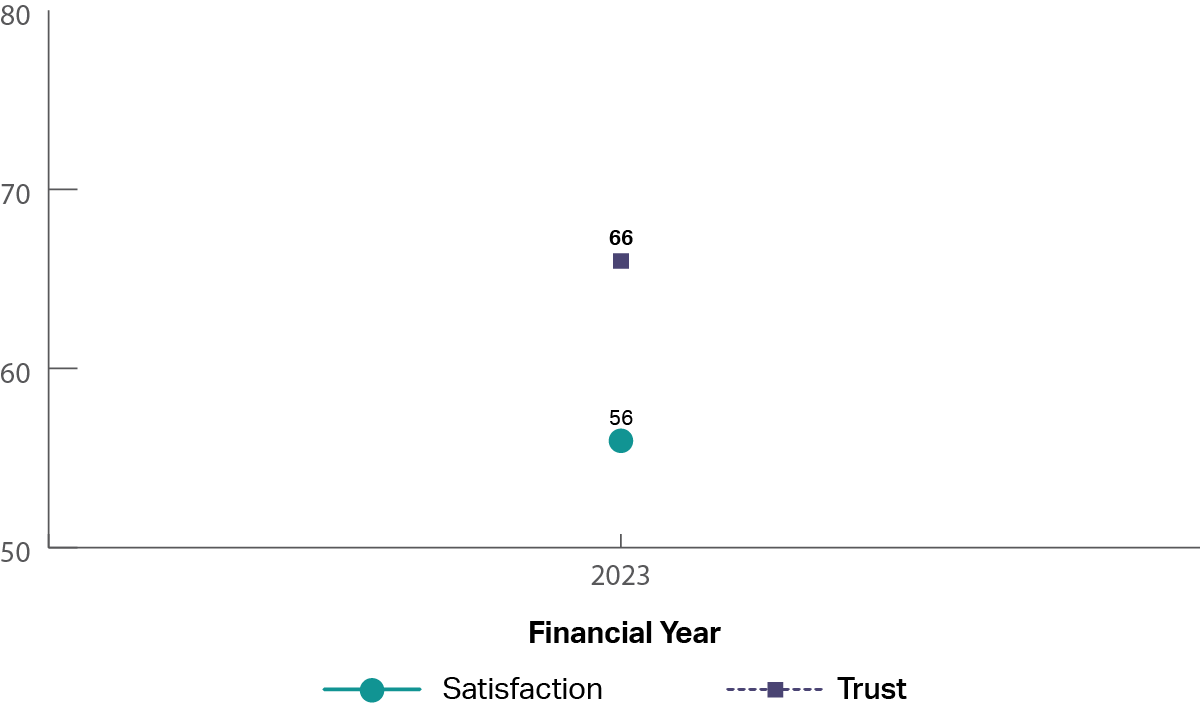
A graph showing the historical trust and satisfaction of Department of Employment and Workplace Relations. The department of Education is a new department and only 2023 is shown.  It shows that trust is 66% and satisfaction is 56% in 2023.

The experience

Image
image of five stars

The top rated drivers of satisfaction were: 

  1. ‘Information from the service was accurate’
  2. ‘Staff treated me with respect’
Image
image of five stars, only one star is coloured showing a low review

The lowest rated drivers of satisfaction were: 

  1. ‘The amount of effort I had to put in was reasonable’
  2. ‘I was kept informed of progress and wait times’

Department of Foreign Affairs and Trade

Who is accessing
Image
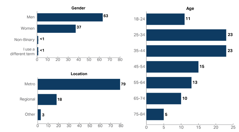
A graph showing the demographic composition of the people who accessed the Department of Foreign Affairs and Trade in 2022-23, including Age, Gender and Location. More men accessed the service than women (Men 63%, Women 37%) and 25-34 and 35-44 year olds were the most common age groups, both with 23% of people.

How are people accessing

Image
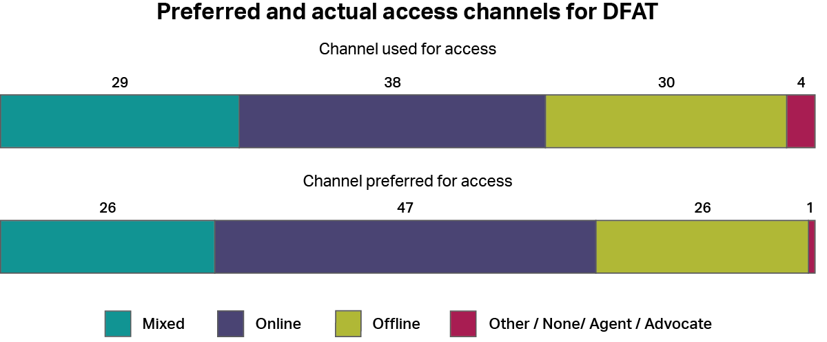
A graph showing how people accessed the Department of Foreign Affairs and Trade, whether by online channels, offline channels, a mixture of both, or other channels. It also shows how people would have preferred to access the service using the same categories. The most common type of access was “online” with 38%, and the most common preferred channel was also “online” with 47%.

Historical Performance

Image
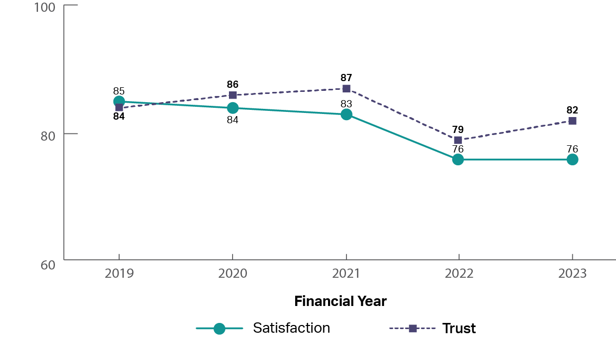
A graph showing the historical trust and satisfaction of Department of Foreign Affairs and Trade from 2019 to 2023.  It shows that trust and satisfaction have been relatively stable from 2019 to 2021, with a dip in 2022. Trust recovered in 2023, but satisfaction remained lower (2019: trust 84%, satisfaction 85%; 2022: trust 79%, satisfaction 76%; 2023: trust 82%, satisfaction 76%).

The experience

Image
image of five stars

The top rated drivers of satisfaction were: 

  1. ‘Information from the service was accurate’
  2. ‘Staff treated me with respect’
Image
image of five stars, only one star is coloured showing a low review

The lowest rated drivers of satisfaction were: 

  1. ‘I was kept informed of progress and wait times’
  2. ‘It was clear I could give feedback about my experience’

Department of Home Affairs

Who is accessing
Image
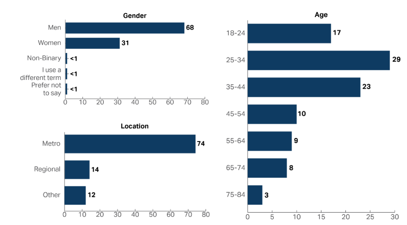
A graph showing the demographic composition of the people who accessed the Department of Home Affairs in 2022-23, including Age, Gender and Location. More men accessed the service than women (Men 68%, Women 31%) and 25-34 year olds were the most common age group with 29% of people.

How are people accessing

Image
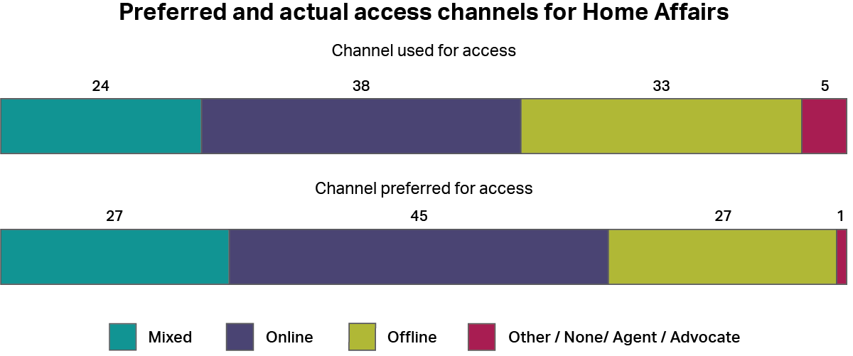
A graph showing how people accessed the Department of Home Affairs, whether by online channels, offline channels, a mixture of both, or other channels. It also shows how people would have preferred to access the service using the same categories. The most common type of access was “online” with 38%, and the most common preferred channel was also “online” with 45%.

Historical Performance

Image
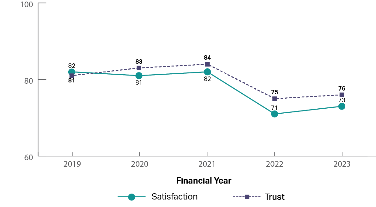
A graph showing the historical trust and satisfaction of Department of Home Affairs from 2019 to 2023.  It shows that trust and satisfaction have been relatively stable from 2019 to 2021, with a dip in 2022 and 2023 (2019: trust 81%, satisfaction 82%; 2022: trust 75%, satisfaction 71%; 2023: trust 76%, satisfaction 73%).

The experience

Image
image of five stars

The top rated drivers of satisfaction were: 

  1. ‘Information from the service was accurate’
  2. ‘Staff treated me with respect’
Image
image of five stars, only one star is coloured showing a low review

The lowest rated drivers of satisfaction were: 

  1. ‘It was clear I could give feedback about my experience’
  2. ‘The amount of time it took to reach an outcome was acceptable’

Department of Veterans’ Affairs

Who is accessing
Image
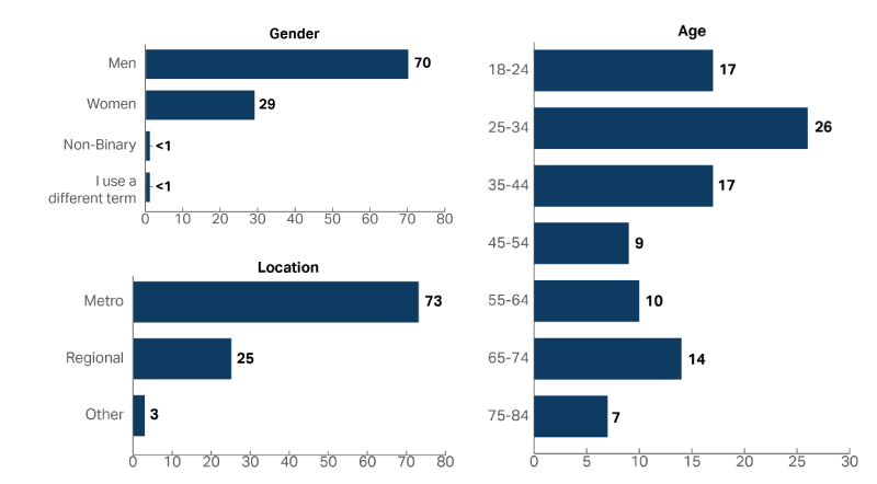
A graph showing the demographic composition of the people who accessed the Department of Veterans’ Affairs in 2022-23, including Age, Gender and Location. More than twice as many men accessed the service than women (Men 70%, Women 29%) and 25-34 year olds were the most common age group with 26% of people.

How are people accessing

Image
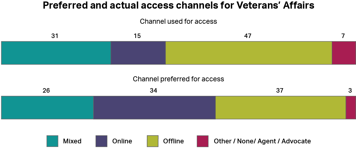
A graph showing how people accessed the Department of Veterans’ Affairs, whether by online channels, offline channels, a mixture of both, or other channels. It also shows how people would have preferred to access the service using the same categories. The most common type of access was “offline” with 47%, and the most common preferred channel was also “offline” with 37%.

Historical Performance

Image
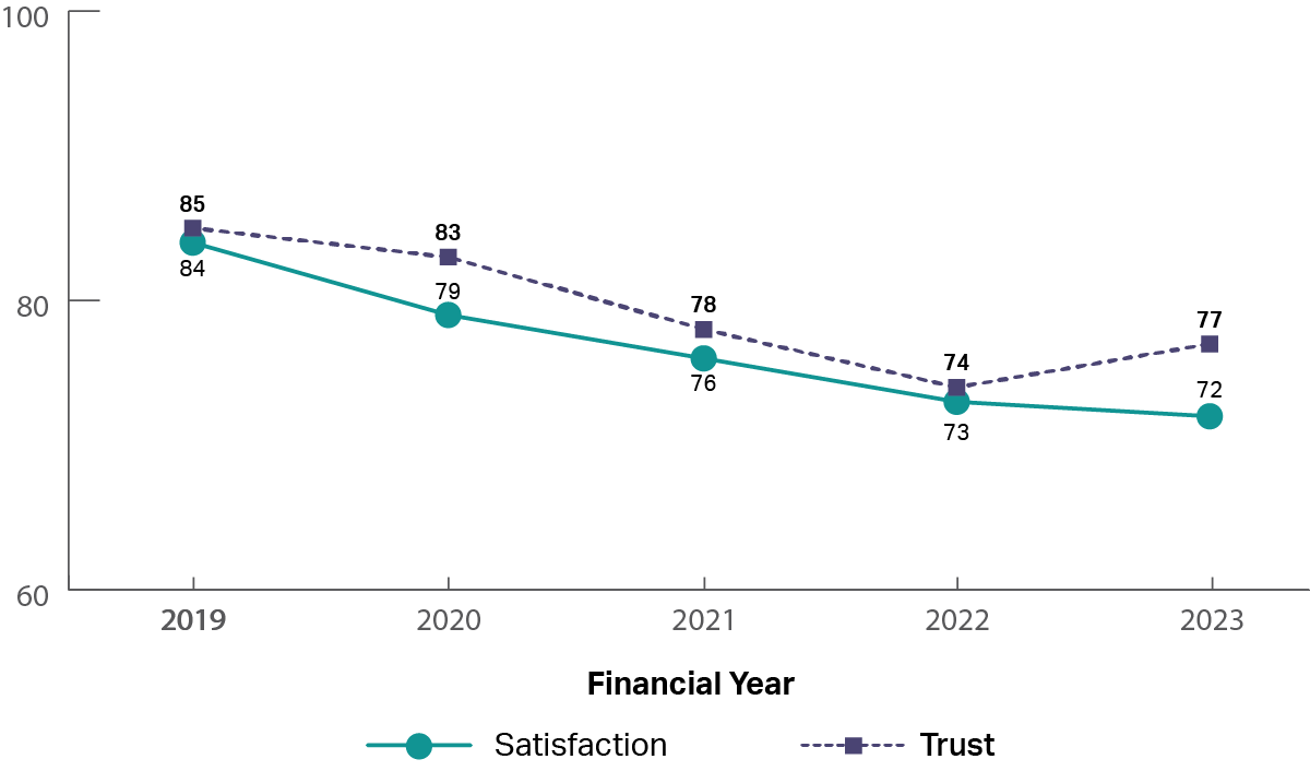
A graph showing the historical trust and satisfaction of Department of Veterans’ Affairs from 2019 to 2023.  It shows that trust and satisfaction have been slowly reducing from 2019 to 2023 (2019: trust 85%, satisfaction 84%; 2023: trust 77%, satisfaction 72%).

The experience

Image
image of five stars

The top rated drivers of satisfaction were: 

  1. ‘Staff treated me with respect’
  2. ‘Staff did what they said they would do’
Image
image of five stars, only one star is coloured showing a low review

The lowest rated drivers of satisfaction were: 

  1. ‘The amount of time it took to reach an outcome was acceptable’
  2. ‘I was kept informed of progress and wait times’

Fair Work Ombudsman

Who is accessing

Image
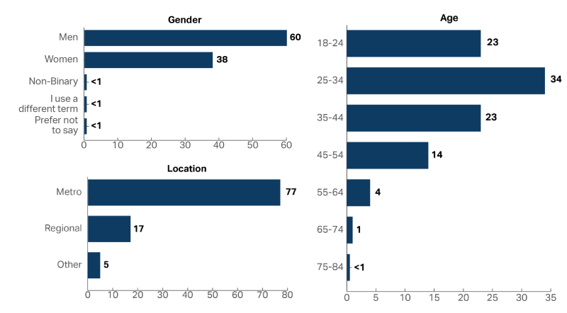
A graph showing the demographic composition of the people who accessed the Fair Work Ombudsman in 2022-23, including Age, Gender and Location. More men accessed the service than women (Men 60%, Women 38%) and 25-34 year olds were the most common age group with 34% of people.

How are people accessing

Image
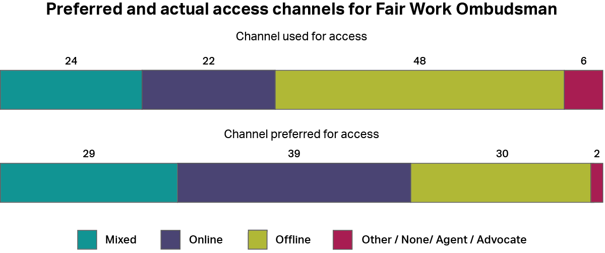
A graph showing how people accessed the Fair Work Ombudsman, whether by online channels, offline channels, a mixture of both, or other channels. It also shows how people would have preferred to access the service using the same categories. The most common type of access was “offline” with 48%, and the most common preferred channel was “online” with 39%.

Historical Performance

Image
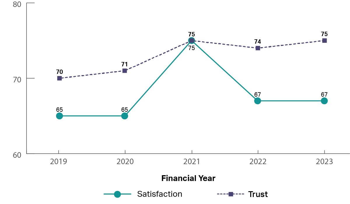
A graph showing the historical trust and satisfaction of the Fair Work Ombudsman from 2019 to 2023.  It shows that trust and satisfaction have been relatively flat from 2019 to 2023, with a small increase in trust (2019: trust 70%, satisfaction 65%; 2023: trust 75%, satisfaction 67%).

The experience

Image
image of five stars

The top rated drivers of satisfaction were: 

  1. ‘Staff treated me with respect’
  2. ‘Staff did what they said they would do’
Image
image of five stars, only one star is coloured showing a low review

The lowest rated drivers of satisfaction were: 

  1. ‘I was kept informed of progress and wait times’
  2. ‘The amount of effort I had to put in was reasonable’

My Aged Care

Who is accessing

Image
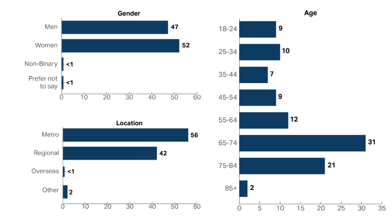
A graph showing the demographic composition of the people who accessed My Aged Care in 2022-23, including Age, Gender and Location. Slightly more women accessed the service than men (Women 52%, Men 47%) and 65-74 year olds were the most common age group with 31% of people.

How are people accessing

Image
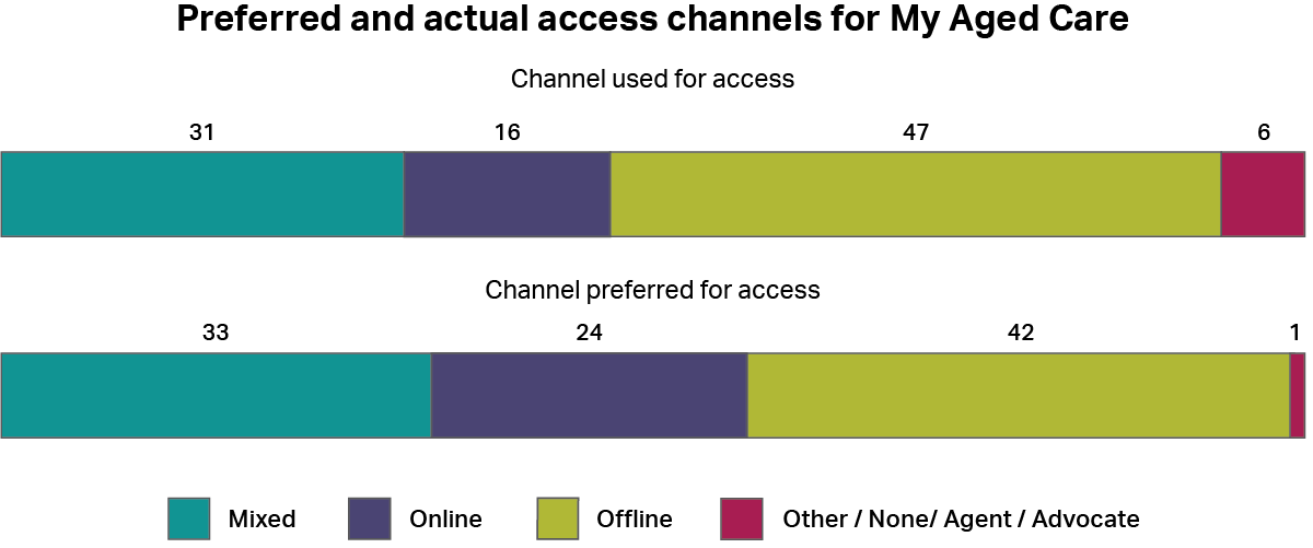
A graph showing how people accessed My Aged Care, whether by online channels, offline channels, a mixture of both, or other channels. It also shows how people would have preferred to access the service using the same categories. The most common type of access was “offline” with 47%, and the most common preferred method was also “offline” with 42%.

Historical Performance

Image
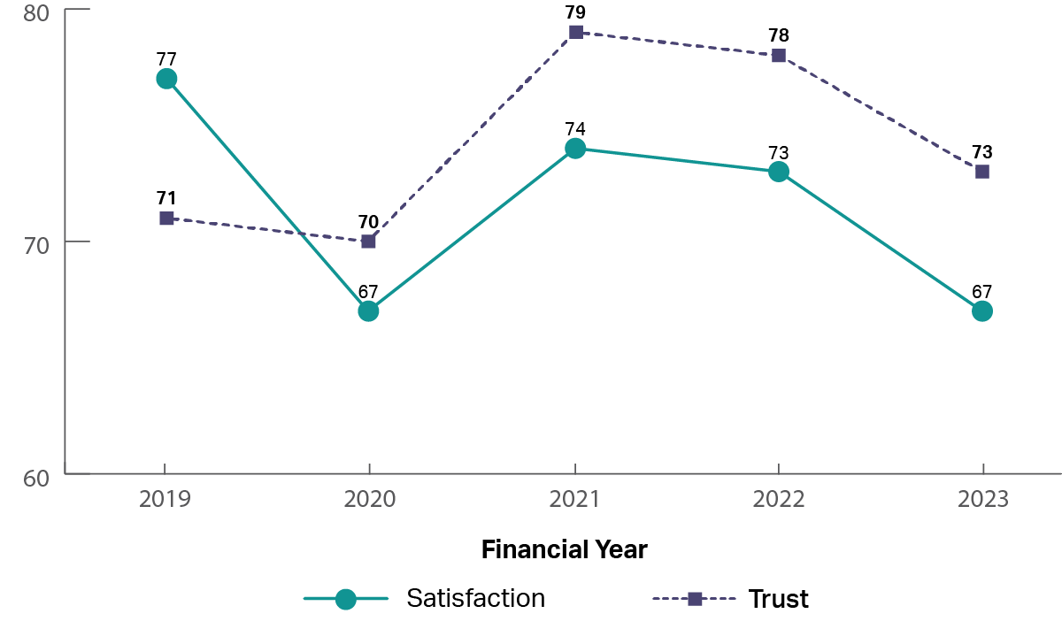
A graph showing the historical trust and satisfaction of My Aged Care from 2019 to 2023.  It shows that trust and satisfaction have been up and down from 2019 to 2023 (2019: trust 71%, satisfaction 77%; 2021: trust 79%, satisfaction 74%; 2023: trust 73%, satisfaction 67%).

The experience

Image
image of five stars

The top rated drivers of satisfaction were: 

  1. ‘Staff treated me with respect’
  2. ‘Staff were knowledgeable’
Image
image of five stars, only one star is coloured showing a low review

The lowest rated drivers of satisfaction were: 

  1. ‘I was kept informed of progress and wait times’
  2. ‘The amount of time it took to reach an outcome was acceptable’

National Disability Insurance Scheme

Who is accessing
Image
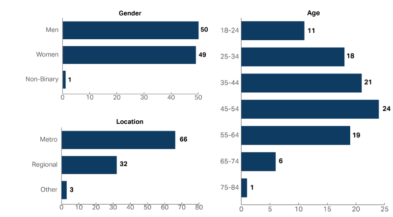
A graph showing the demographic composition of the people who accessed the National Disability Insurance Scheme in 2022-23, including Age, Gender and Location. Approximately the same proportion of women accessed the service as men (Women 49%, Men 50%) and 45-54 year olds were the most common age group with 24% of people.

How are people accessing

Image
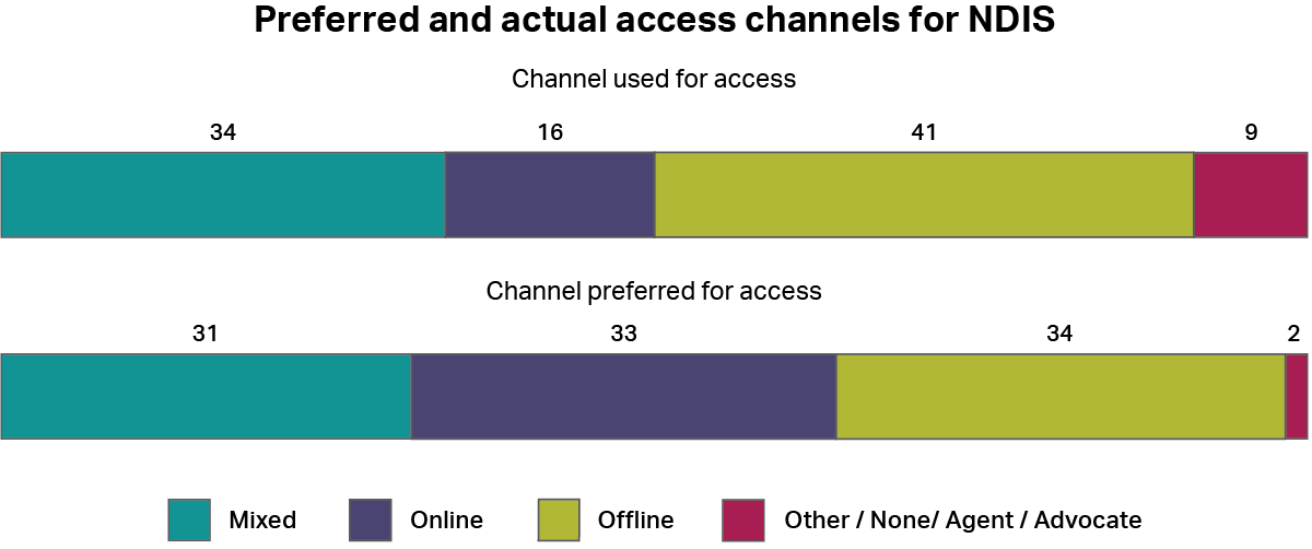
A graph showing how people accessed the National Disability Insurance Scheme, whether by online channels, offline channels, a mixture of both, or other channels. It also shows how people would have preferred to access the service using the same categories. The most common type of access was “offline” with 41%, and the most common preferred channel was also “offline” with 34%, and “online” with 33%.

Historical Performance

Image
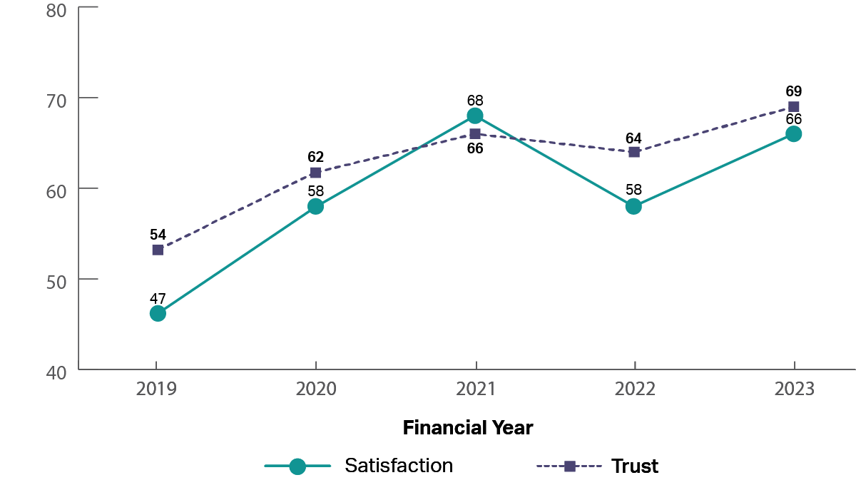
A graph showing the historical trust and satisfaction of the National Disability Insurance Scheme from 2019 to 2023.  It shows that trust and satisfaction have been steadily increasing from 2019 to 2023 (2019: trust 54%, satisfaction 47%; 2021: trust 66%, satisfaction 68%; 2023: trust 69%, satisfaction 66%).

The experience

Image
image of five stars

The top rated drivers of satisfaction were: 

  1. ‘Staff treated me with respect’
  2. ‘Staff did what they said they would do’
Image
image of five stars, only one star is coloured showing a low review

The lowest rated drivers of satisfaction were: 

  1. ‘I was kept informed of progress and wait times’
  2. ‘The amount of time it took to reach an outcome was acceptable’

Parks Australia

Who is accessing

Image
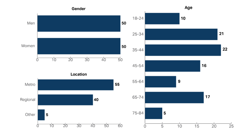
A graph showing the demographic composition of the people who accessed Parks Australia in 2022-23, including Age, Gender and Location. The same proportion of women accessed the service as men (Women 50%, Men 50%) and 35-44 year olds were the most common age group with 22% of people.

How are people accessing

Image
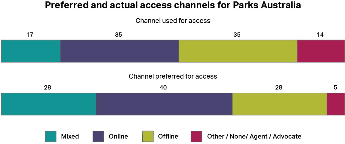
A graph showing how people accessed Parks Australia, whether by online channels, offline channels, a mixture of both, or other channels. It also shows how people would have preferred to access the service using the same categories. The most common types of access were “online” and “offline” both with 35%. The most common preferred method was “online” with 40%.

Historical Performance

Image
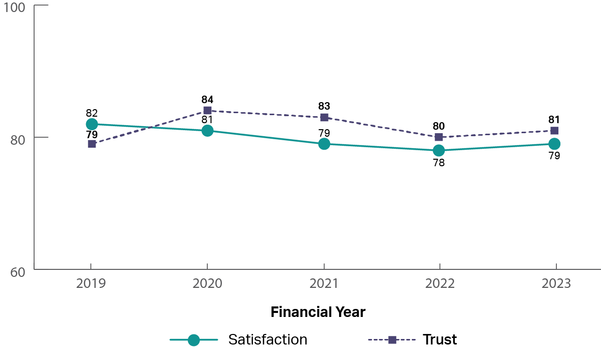
A graph showing the historical trust and satisfaction of Parks Australia from 2019 to 2023.  It shows that trust and satisfaction have been steady from 2019 to 2023 (2019: trust 79%, satisfaction 82%; 2021: trust 83%, satisfaction 79%; 2023: trust 81%, satisfaction 79%).

The experience

Image
image of five stars

The top rated drivers of satisfaction were: 

  1. ‘Staff did what they said they would do’
  2. ‘It was easy to access the service(s)’
Image
image of five stars, only one star is coloured showing a low review

The lowest rated drivers of satisfaction were: 

  1. ‘I was kept informed of progress and wait times’
  2. ‘It was explained how my personal information would be used and stored’

Pharmaceutical Benefits Scheme

Who is accessing
Image
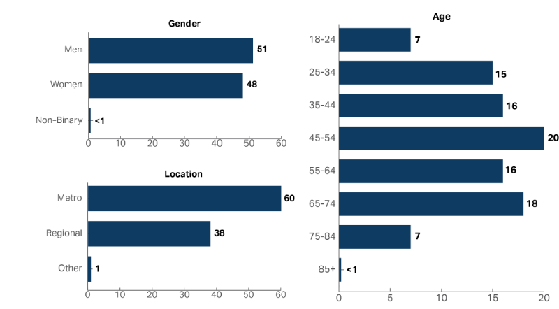
A graph showing the demographic composition of the people who accessed the Pharmaceutical Benefits Scheme in 2022-23, including Age, Gender and Location. Approximately about the same proportion of women accessed the service as men (Women 48%, Men 51%) and 45-54 year olds were the most common age group with 20% of people.

How are people accessing

Image
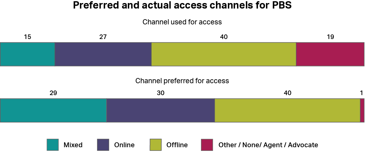
A graph showing how people accessed the Pharmaceutical Benefits Scheme, whether by online channels, offline channels, a mixture of both, or other channels. It also shows how people would have preferred to access the service using the same categories. The most common type of access was “offline” with 40%, and the most common preferred channel was also “offline” with 40%.

Historical Performance

Image
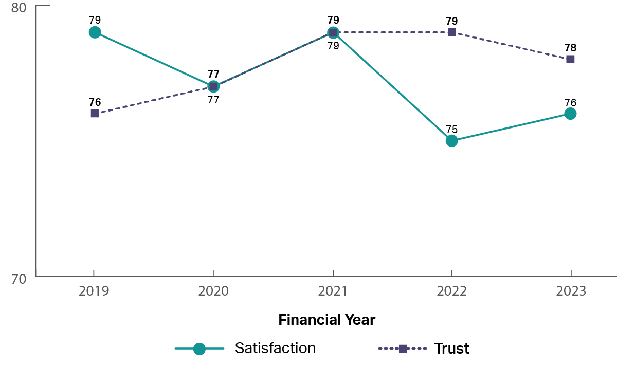
A graph showing the historical trust and satisfaction of the Pharmaceutical Benefits Scheme from 2019 to 2023.  It shows that trust and satisfaction have been steady from 2019 to 2023 (2019: trust 76%, satisfaction 79%; 2021: trust 79%, satisfaction 79%; 2023: trust 78%, satisfaction 76%).

The experience

Image
image of five stars

The top rated drivers of satisfaction were: 

  1. ‘Staff were knowledgeable’
  2. ‘Information from the service was accurate’
Image
image of five stars, only one star is coloured showing a low review

The lowest rated drivers of satisfaction were: 

  1. ‘The amount of time it took to reach an outcome was acceptable’
  2. ‘I was kept informed of progress and wait times’

Services Australia - Centrelink

Who is accessing
Image
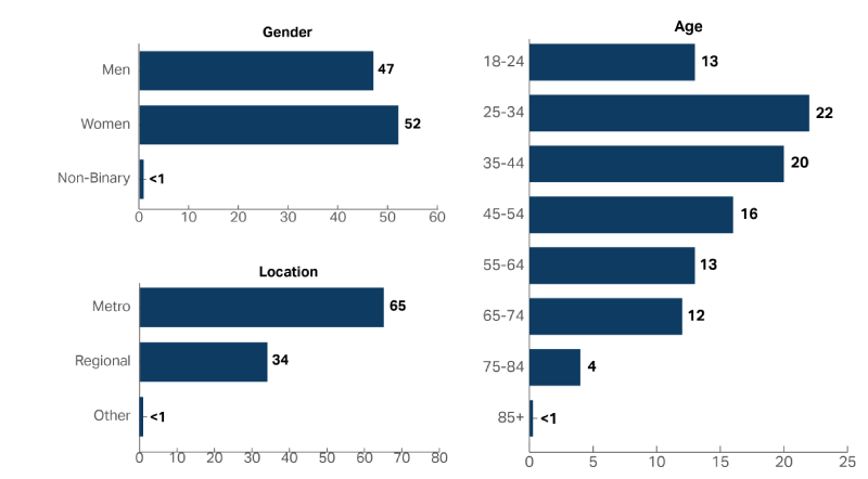
A graph showing the demographic composition of the people who accessed Services Australia - Centrelink in 2022-23, including Age, Gender and Location. Slightly more women accessed the service than men (Women 52%, Men 47%) and 25-34 year olds were the most common age group with 22% of people.

How are people accessing

Image
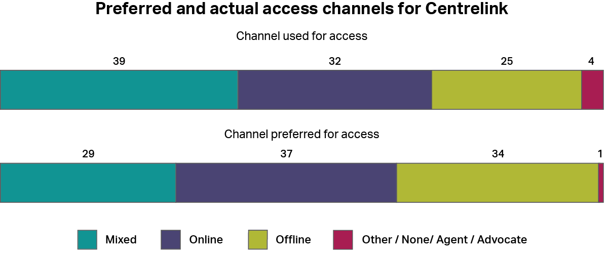
A graph showing how people accessed the Services Australia - Centrelink whether by online channels, offline channels, a mixture of both, or other channels. It also shows how people would have preferred to access the service using the same categories. The most common type of access was “online” with 32%, and the most common preferred channel was also “online” with 37%.

Historical Performance

Image
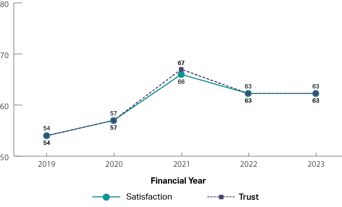
A graph showing the historical trust and satisfaction of the Services Australia - Centrelink from 2019 to 2023.  It shows that trust and satisfaction increased from 2019 to 2021, with a small drop since then (2019: trust 54%, satisfaction 54%; 2021: trust 67%, satisfaction 66%; 2023: trust 63%, satisfaction 63%).

The experience

Image
image of five stars

The top rated drivers of satisfaction were: 

  1. 'Staff treated me with respect'
  2. ‘I got what I needed’
Image
image of five stars, only one star is coloured showing a low review

The lowest rated drivers of satisfaction were: 

  1. ‘The amount of time it took to reach an outcome was acceptable’
  2. ‘I was kept informed of progress and wait times’

Services Australia - Child Support

Who is accessing
Image
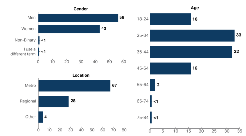
A graph showing the demographic composition of the people who accessed Services Australia - Child Support in 2022-23, including Age, Gender and Location. More men than women accessed the service (Women 43%, Men 56%) and 25-34 year olds were the most common age group with 33% followed by 35-44 year olds with 32% of people.

How are people accessing

Image
A graph showing how people accessed the Services Australia - Child Support whether by online channels, offline channels, a mixture of both, or other channels. It also shows how people would have preferred to access the service using the same categories. The most common type of access was “offline” with 40%, and the most common preferred channel was also “offline” with 38%.

Historical Performance

Image
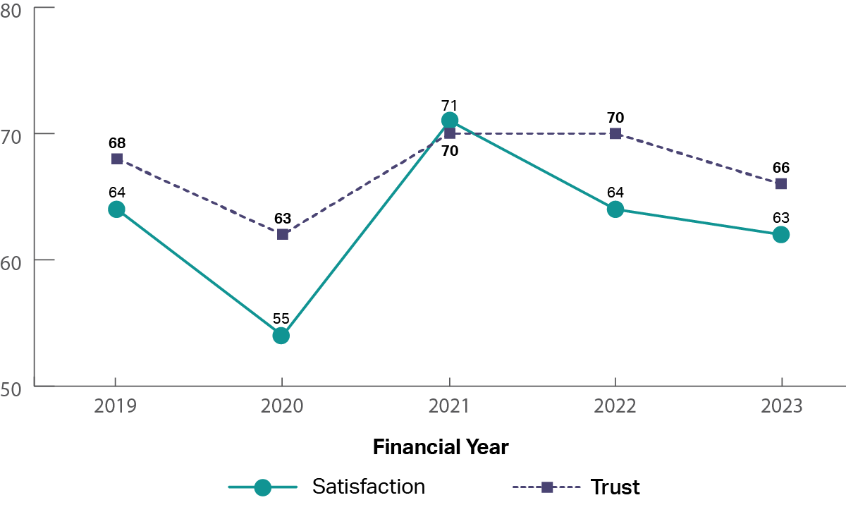
A graph showing the historical trust and satisfaction of the Services Australia - Child Support from 2019 to 2023.  It shows that trust and satisfaction have been up and down from 2019 to 2023 (2019: trust 68%, satisfaction 64%; 2020: trust 63%, satisfaction 55%; 2021: trust 70%, satisfaction 71%; 2023: trust 66%, satisfaction 63%).

The experience

Image
image of five stars

The top rated drivers of satisfaction were: 

  1. ‘Staff treated me with respect’
  2. ‘Staff were knowledgeable’
Image
image of five stars, only one star is coloured showing a low review

The lowest rated drivers of satisfaction were: 

  1. ‘Processes clear and easy to follow’
  2. ‘The amount of time it took to reach an outcome was acceptable’

Services Australia - Medicare

Who is accessing
Image
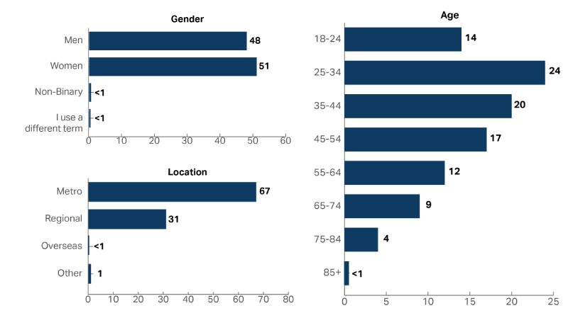
A graph showing the demographic composition of the people who accessed Services Australia - Medicare in 2022-23, including Age, Gender and Location. Approximately the same proportion of women accessed the service as men (Women 51%, Men 48%) and 25-34 year olds were the most common age group with 24% of people.

How are people accessing

Image
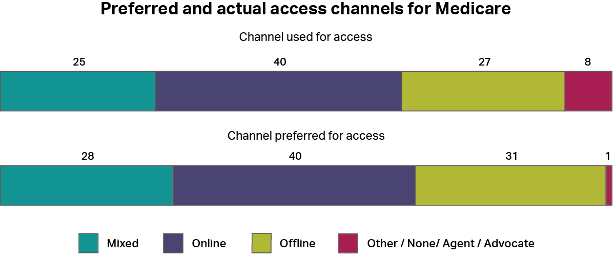
A graph showing how people accessed the Services Australia - Medicare whether by online channels, offline channels, a mixture of both, or other channels. It also shows how people would have preferred to access the service using the same categories. The most common type of access was “online” with 40%, and the most common preferred channel was “online” also with 40%.

Historical Performance

Image
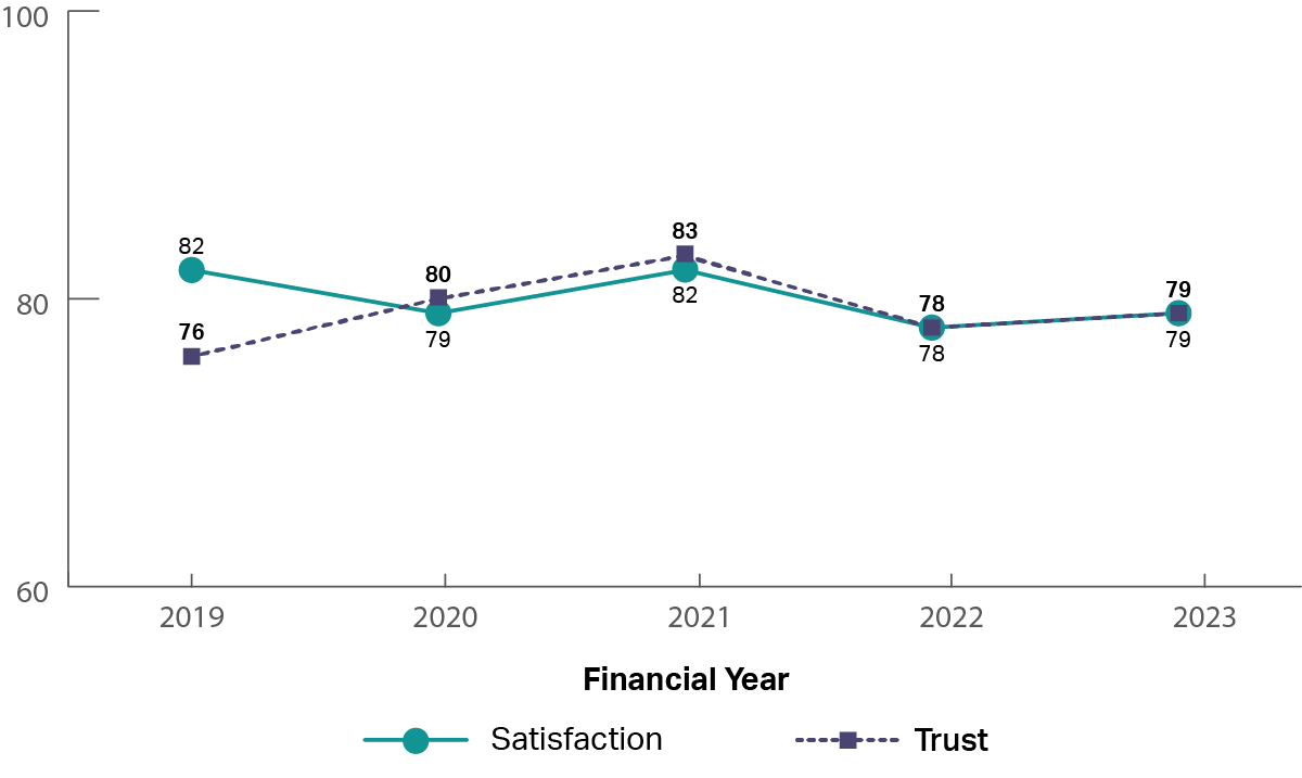
A graph showing the historical trust and satisfaction of the Services Australia - Medicare from 2019 to 2023.  It shows that trust and satisfaction have been steady (2019: trust 76%, satisfaction 82%; 2021: trust 83%, satisfaction 82%; 2023: trust 79%, satisfaction 79%).

The experience

Image
image of five stars

The top rated drivers of satisfaction were: 

  1. ‘Staff treated me with respect’
  2. ‘Information from the service was accurate’
Image
image of five stars, only one star is coloured showing a low review

The lowest rated drivers of satisfaction were: 

  1. ‘It was clear I could give feedback about my experience’
  2. ‘I was kept informed of progress and wait times’